Taking stock of Peter Saville as his work enters the nation’s art collection
For the Tate to decide to acquire a selection of work by designer Peter Saville is not entirely without precedent. The museum took on the extensive archive of David King, the graphic designer who, among other things, designed the Electric Ladyland album cover for Jimi Hendrix, and The Who Sell Out for The Who. But powerful though these two designs undoubtedly were, along with King’s work as an art director for the Sunday Times, and his designs for a variety of left-leaning causes from the Anti-Nazi League to Rock Against Racism, it helped convince the Tate that they came with King’s unparalleled collection of Soviet photography from the heroic era, printed books and images of the victims of Stalin’s purges.
The Tate’s interest in Saville is different. Saville’s brilliant work for Factory Records, and in particular Joy Division and its successor New Order, captured the imagination of a generation not just of British artists as adolescents, but also Americans such as Julian Schnabel and Robert Longo.
For five decades, since first starting to work with Anthony Wilson – Cambridge University graduate, BBC TV presenter, music world entrepreneur and co-founder of Manchester’s Hacienda Club – Saville has done as much as anyone to reshape the visual language of culture.
“I was in my last year as a student and heard that he was starting a club. I waited in the lobby of the studio, introduced myself to him, showed him my book of Jan Tschichold (the modernist German typographer who had died a couple of years earlier). I explained that it was the kind of thing that I would like to do.” The encounter led to a poster for the Hacienda’s predecessor, a regular club night. Six months later, Saville was in the room when Wilson and his friend Alan Erasmus began discussing the possibility of releasing records by some of the musicians playing at the club, and became the designer for Factory Records. He has dissolved the category division between what was once described as high art and popular art, to the extent that he was played by Enzo Cilenti in Steve Coogan’s film 24 Hour Party People. Saville has worked with the Pace Gallery to release an artwork that combines sound and vision at this year’s Frieze, and could now be understood as having transcended the sharp edges between design and art.
Saville and his school friend Malcolm Garrett were responsible for triggering a late-flowering golden period for the not-so-minor art form of album design. The album-art genre emerged in the 1940s, when Columbia Records employed Alex Steinweiss as its first art director. He transformed what had previously been utilitarian paper sleeves into colourful cardboard albums that mixed illustration, collage, and photography. Despite the tight restrictions of the format, the album cover transformed from humble packaging into an art form. Robert Rauschenberg, Richard Hamilton and Andy Warhol all conceived covers (respectively for Talking Heads, The Beatles and The Velvet Underground).
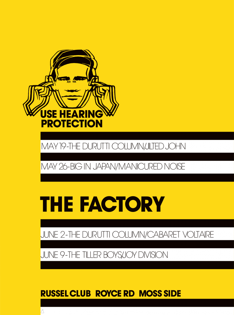
Wilson gathered around him a group of designers and musicians that took what they were doing seriously. What made Saville’s work stand out was an openness to a wider range of references and interests than his peers. Ben Kelly, the interior architect who designed the Hacienda, used an image derived from Marcel Duchamp’s ‘Coffee Grinder’ painting on his letter head and business card. One of Wilson’s bands called itself The Durutti Column. The name comes from Buenaventura Durruti, the anarchist who led a column of fighters from Barcelona to Zaragoza to fight fascism during the Spanish Civil War, by way of a strip cartoon made by a situationist group in the 1960s. Their first album came in a sandpaper cover that threatened irreparable damage to any vinyl that it happened to come into contact with. The Hacienda itself was another reference to situationism. It comes from a text by Ivan Chtcheglov, who plotted to blow up the Eiffel Tower and wrote ‘Formulaire pour un urbanisme nouveau’, one of the founding texts of situationism, aged 19.
“And you, forgotten, your memories ravaged by all the consternations of two hemispheres, stranded in the Red Cellars of Pali-Kao, without music and without geography, no longer setting out for the hacienda where the roots think of the child and where the wine is finished off with fables from an old almanac. That’s all over. You’ll never see the hacienda. It doesn’t exist.
The hacienda must be built.”
Saville always credits Garrett and Kelley for triggering his interest in using design to explore some of the less obvious resonances and nuances of contemporary art. “Through the conduit of my friend Malcom Garrett, but not my tutors, I had become interested in the canonical modes of art and the niche codes of pop culture tribes.”
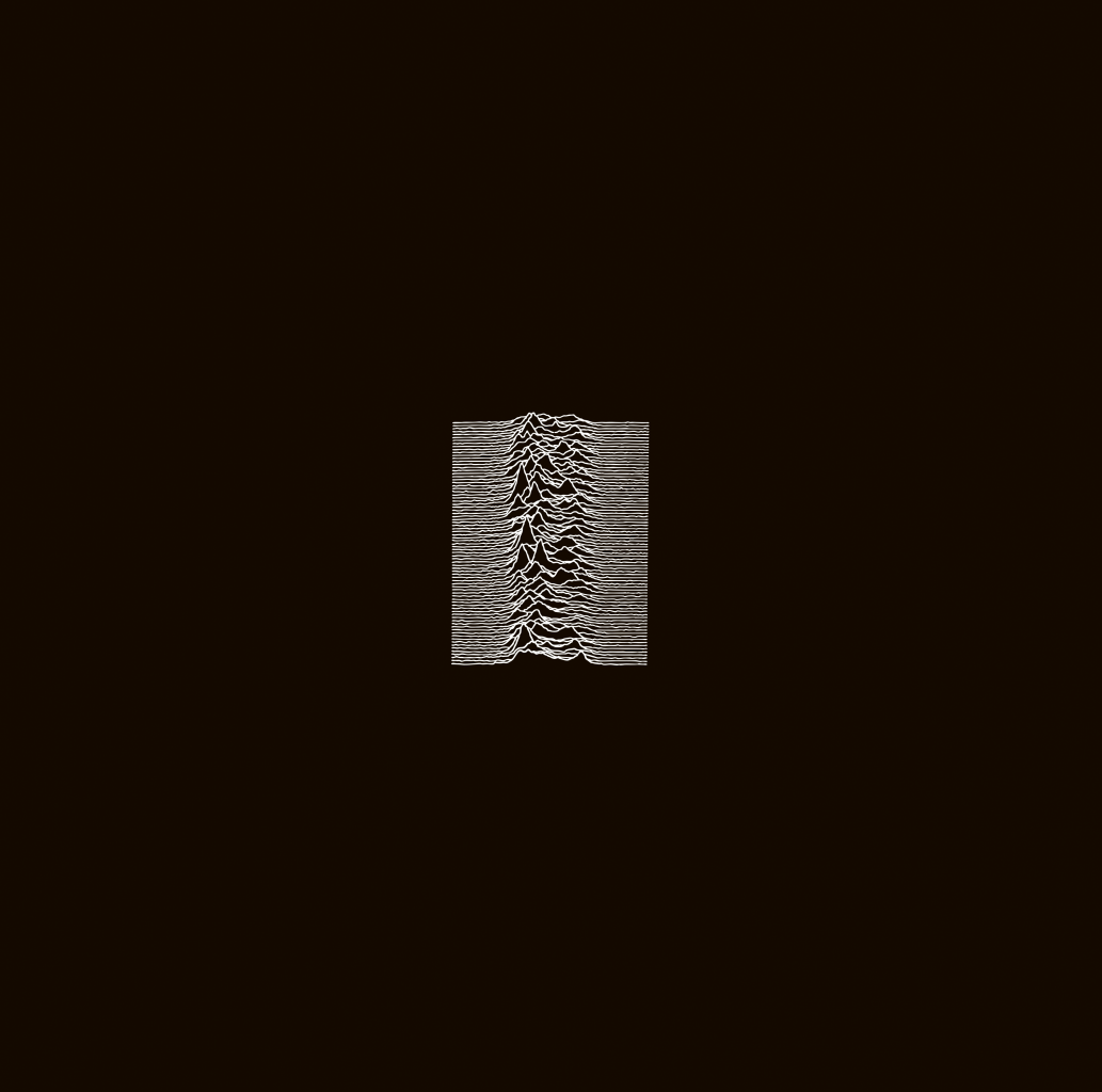
Unknown Pleasures, Saville’s first album cover for Joy Division, came out in 1979. This was a year after he managed to graduate from Manchester Polytechnic, with a less than enthusiastic response from his tutors, who did not see him as a suitable role model. He used a found diagram of a pulsar, a distant star blasting out rhythmic blasts of energy, from the Cambridge Encyclopaedia of Astronomy. For Closer, Joy Division’s next album, he used a photograph taken a couple of years earlier by Bernard Pierre Wolff (the French photographer and art director), of a turn-of-the-century tomb sculpted by Demetrio Paernio for the Appiani family in the Monumental Cemetery of Staglieno in Genoa. The image and the use to which it was put could be understood on multiple levels.
Cover design Peter Saville from an image sourced by Bernard Sumner
Unsettlingly, Joy Division’s Ian Curtis took his own life shortly before the record was released. Saville had shown the group a collection of Wolff ’s photographs and they had all accepted Saville’s idea. The design has been subject to a great deal of analysis. It could be interpreted as an evocation of the sombre melancholy of the music, or of taking its mood from Wolff’s photography – who would himself die prematurely. Was it the original sub-Canova sculpture that Saville was inviting us to consider, or his interpretation of it? Adding yet another layer, the New York artist Julian Schnabel refers to Saville’s design in his own painting, ‘Ornamental Despair’.
By then, Joy Division had become New Order, and its album Power, Corruption & Lies (1983) used a reproduction of ‘A Basket of Roses’, by the not-that-well-known French artist Henri Fantin-Latour.
It was an intriguing choice on several levels. Fantin-Latour was a contemporary of Degas, and a friend of Whistler, but his careful realism made his work seem quite conservative. He had not had a UK gallery exhibition in decades when Saville found the image. Saville saw the inescapably short-lived lush beauty of cut flowers as a representation of imminent corruption, and was using it as a response to just the title New Order gave him. “I never had the chance to interpret music while I was doing a cover,” says Saville. “If you went to a session, you might get to listen to four hours of drumming, or a demo tape, neither of which would bear much relation to the final recording.” Fantin-Latour in his own lifetime had been interested in music, with his lithographs and paintings inspired by Wagner and other composers.
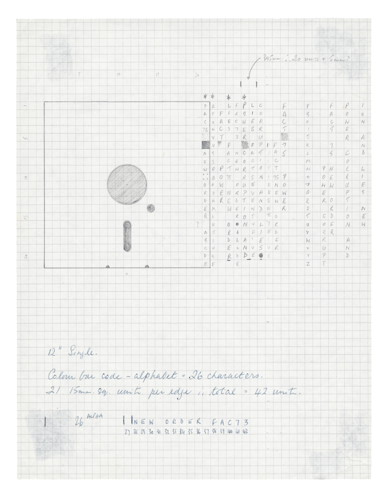
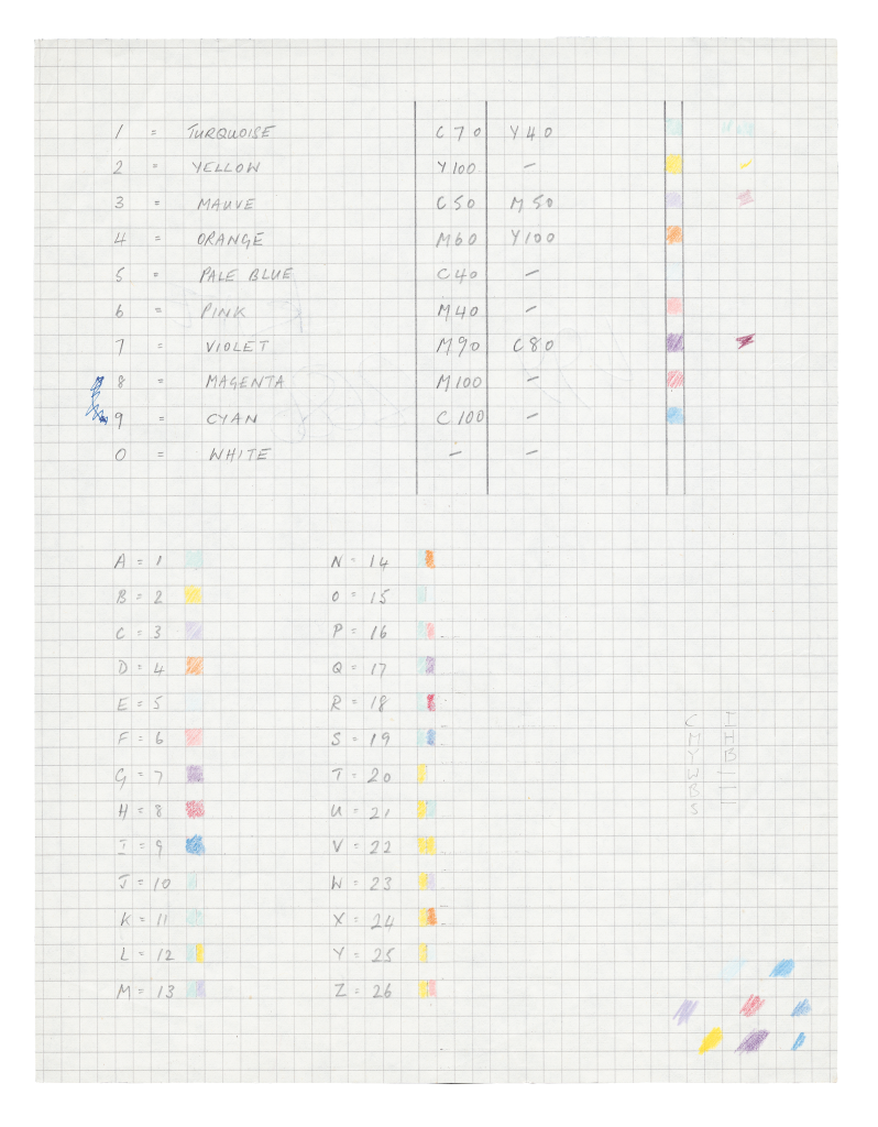
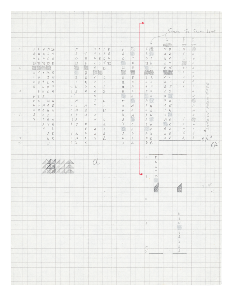
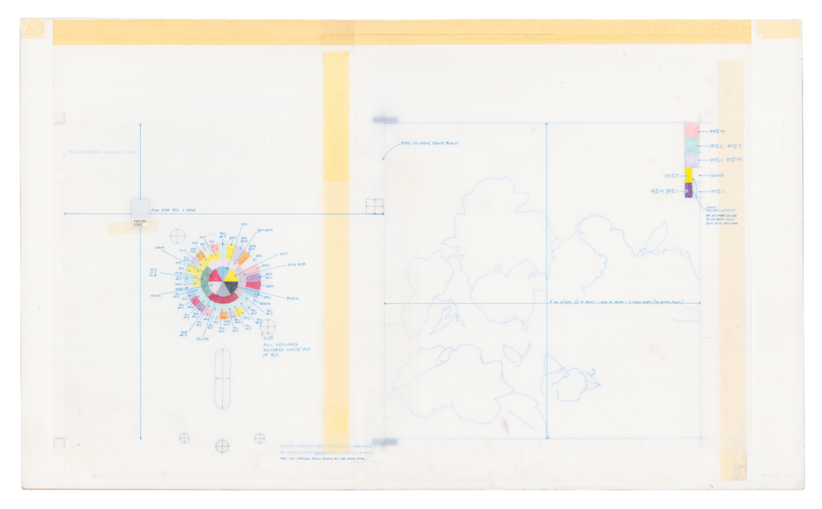
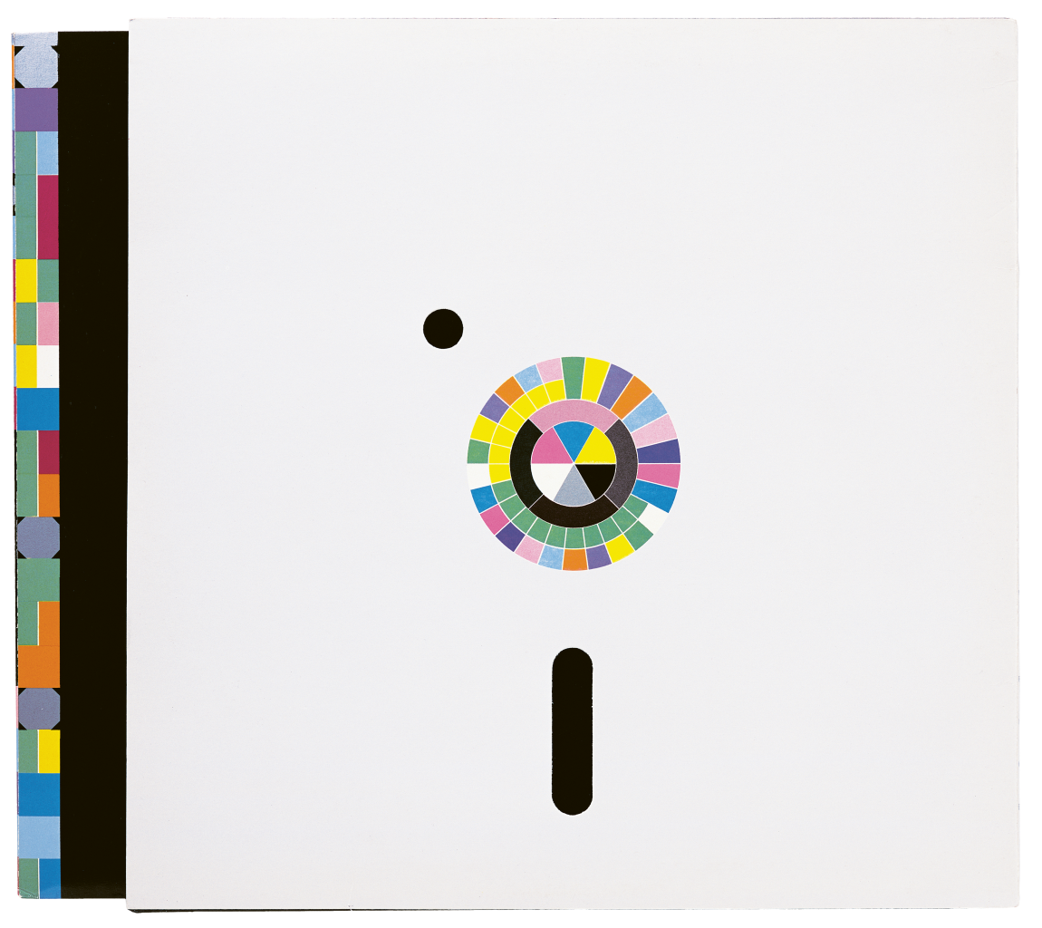
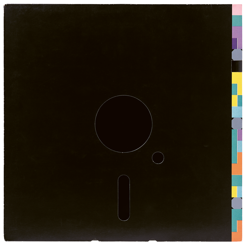
Saville did not want to put type on the cover; instead he used a colour code to spell out the title and the band’s name. On the reverse, there was a colour wheel that provided the key to the code. He did something similar with Blue Monday, a 12-inch vinyl single with a die-cut sleeve evoking a floppy disc, using the colour wheel code to spell out the name of the tracks. As Saville explained, “it reflected the hieroglyphic visual language of the machine world.”
Britain was particularly fertile ground for designers specialising in album covers. Storm Thorgerson and Aubrey Powell established art design group Hipgnosis, and produced their first cover in 1968 for Pink Floyd’s A Saucerful of Secrets. This was the start of an approach that was supplanted by the punk explosion, with Jamie Reid’s work for the Sex Pistols or Barney Bubbles’ design for Elvis Costello and the Attractions’ Get Happy!! Album art’s last flowering before the digital explosion swept it away was the creative abstraction of Peter Saville’s colour wheel design for New Order’s Power, Corruption & Lies, and Malcolm Garrett’s work for The Buzzcocks’ A Different Kind of Tension.
Saville however, has not limited himself to music. He has had as much impact in the last decade on fashion, a much more well-organised and well-funded industry.
He is not, in Saville’s own words, particularly interested in the mechanics of graphic design, though he is most often described as a graphic designer. He is not running a conventional design studio – he has tried that twice. First, on his own account, when he lost so much money that he faced insolvency. Then again, when he joined Pentagram as a partner in 1990. That didn’t work out either. He was moving from the music world with very limited budgets (despite the high-profile nature of the work) to become part of a group that relies on generous corporate creative budgets. Against expectations, he was able to bill clients enough not to cost the collectively owned partnership anything, but he was asked to leave after two years nonetheless.
It was a long time ago and the wounds have healed. Saville was asked to speak at a dinner last year to celebrate Pentagram’s foundation in 1972. “I think,” he recalls, smoking a cigarette on the outdoor terrace of the restaurant in which we are having lunch, “that I was guilty of a profound error. When I joined, I had the impression that the existing partners had invited me to become part of Pentagram because they recognised that the original idea of the firm was in need of a little updating.”
Pentagram’s official history suggests that the younger members were thrilled but the old guard failed to come to terms with Saville’s star status within the design world. That is not entirely the way that Saville sees it. “The kind of work they were doing was based on visual puns. The studio entrance had a brick wall covered in the architect Theo Crosby’s collection of African masks; I would have taken them down, though my grown-up self today probably wouldn’t. What I quickly realised was that I was quite wrong. My partners, or some of them at least – Alan Fletcher and I were always able to playfully taunt each other – thought that because I had agreed to join, I was endorsing them, proving that they had been right all along. I was acknowledging that my work, so different from their approach, had been in error. I was the opposite of the New York 1960s school of visual wit and puns. It was a powerful visual style that appealed to 90 per cent of the population and over time, I’ve come to understand it. But back then I was interested in something different. So I was actually speaking to the other 10 per cent of the population.”
Despite Peter Saville’s misapprehension about Pentagram’s ambitions, he would have brought something significant to the studio. He has a finely tuned ability to sense exactly where the world is going. Not in the manner of charlatan trend-forecasting consultancies that babble on about the “phygital”. Saville has had the ability to shape creative weather, not only for the music world, but more recently for the fashion and luxury market. The artists and fashion designers that were students in the 1980s grew up with New Order on playlists; Robert Longo got to know him in the 1980s, Peter Doig sold badges designed by Saville. Raf Simons acknowledged Saville’s archive as the point of departure for two of his collections.
It’s not just being in the right place at the right time, nor being in the right generation. Though being at art school in Manchester in the 1970s and taking part in shaping Factory Records and the Hacienda certainly helped. Saville is closely connected with the revitalisation of Manchester; he had the title of the city’s consultant creative director from 2004 to 2011, and is still closely involved with its ambitious new cultural centre – known, until Aviva had to step in and fill a funding gap, as Factory International. He moved to London shortly after graduating.
He was certainly in the right place hanging out in Plaza, a shop on Chelsea’s King’s Road that sold suits designed by Antony Price. They were shown flat on boards, as if in a quartermaster’s store. The window display was a slide projector. The message was definitely hostile, and designed to deter those who were unlikely to find the clothes inside appealing. Price was responsible for creating Bryan Ferry and Roxy Music’s distinctive look, and came into the shop one day with two albums that he had bought “not because of the music but for the covers”. They were Saville designs, and led to a commission for Ferry’s Flesh and Blood.
When Paul McCartney was rehearsing for a worldwide tour, this portfolio persuaded him to fly Saville to San Francisco, to talk about what the live album might look like. “He played ‘Hey Jude’ during the sound check, and it felt like he was playing for me. I suggested that it would be good to use documentary photography as if it was a Beatles tour,” remembers Saville. The result was the Tripping the Light Fantastic cover.

When music moved on, so did Saville. He has pivoted toward the world of fashion, a shift that began with a commission from a young photographer called Nick Knight for a business card and poster. “I did something very rational, and Nick told me that he was profoundly disappointed, he wanted something more like Ceremony. I was working with Brett Wickens and he said, ‘He wants a coat of arms. Let’s give him one’. He was delighted.”
Soon after, Knight came back with a project that he was working on for Yohji Yamamoto and the fashion art director Marc Ascoli. Knight persuaded them that they needed a graphic designer. Saville’s work with Yamamoto was the beginning of a new approach to fashion communication, as his record projects were for music. He would go on to work for Ferragamo, Calvin Klein, and most visibly for Burberry. “I was with Riccardo Tisci in an office at Burberry, surrounded by archival references. He told me, ‘Choosing the right logo for a trench coat is easy, but to use that same logo on a chiffon blouse, that is my problem.’”
![]()
![]()
It is a field that both fascinates him and bemuses him. “It’s a handicap or the failing of my vanity. I only want to do things I can personally relate to. What would I do if it were me? What if I was Calvin Klein – it’s an entirely subjective approach to communication in a world that is objective.
I understand about ‘merch’, I am still getting regular payments for work I did for music that is driving the merchandise business. What I am doing for fashion is not so different. I am designing signifiers. I was sitting in a café the other day, and I saw a gauche looking kid walk past with his parents, and he was wearing a Burberry sweatshirt that retails for £700, with my logo printed across it. I know what it costs to make, and I couldn’t help wondering what it was that made him want it.”
This article is taken from Port issue 33. To continue reading, buy the issue or subscribe here


